

Dryfter is a platform targeted towards young working professionals, who are also very interested in traveling. Dryfter offers an opportunity to change the work environment by offering fully-equipped houses in different locations to escape from the usual work routine.
During the pandemic, many companies switched their work style to work from home. As a result, remote work can impact mental health. Causing blurred boundaries between the office work and the living space.
.gif)
Dryfter website is used as a tool for professionals to change their work environment through the booking of a house in a different place. To escape the routine and become more efficient by doing chores in a different environment.
Currently, the website is not very functional, and it’s very difficult to understand. Moreover, the design is very dull. Therefore I’ve come up with some goals
As a result, the routine feels more exhausting and the productivity and health of the individuals could be affected. Dryfter seeks to be a platform to ease their pressure through their booking services of fully equipped houses in different environments. How can the website be improved, so that the amount of clients increases?

For the heuristic analysis, I decided to follow the Jakob Nielsen system. I will inspect the website and I will document any issue I have while using the platform, and then I will decide on a score of severity.
The main use of the website would be to find a house and make a reservation. The website should revolve around this feature working. Therefore the task will be, make a reservation for a room or a house, on the Dryfter website.
For the severity score, I decided to use the three factors suggested by Nielsen. Frequency: Is it common that the problems occur or is it rare? Impact: Will it be easy to overcome for the users?Persistence: How usually does the same problem happen?
Therefore I will also be using the rating scale suggested, with some minor changes.
The most important thing for the website is the booking, most of the clients will be looking at the platform for that reason. Therefore, for the analysis, the focus will be on the parameters that need to be used to complete the process of a successful booking.


I did two different interviews, the first one was an interview with 5 persons to ask them to try the old website. First I would ask them some background questions to understand what they do and what their needs are while working form home. After that I proceeded to explain to them the task they would do. Which was trying to book a house using only the information the website provides to do that. While they were doing the task I took their time. Finally, I would ask them what are their thoughts about the website and what they liked about it, and what they disliked about it.
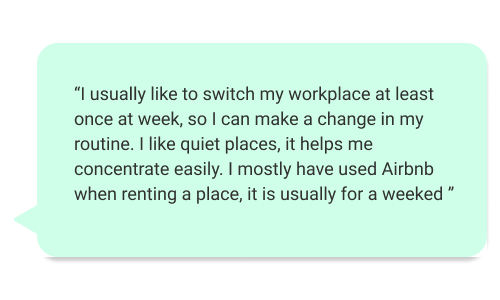
The second part of the interview it was about workspaces and travelling. How often do they change workplaces? what things do the look for in a workplace? if they have ever used any platform for renting a place while travellling? and some other questions. Here's some of the answers :


.gif)
.gif)

After the interviews I decided to do a survey to gather information about what do the users look for in a workplace? and also to answer my questions about travelling, and what kind of platform have they used to book a place to stay.
Using the information gathered by the interviews and the survey, I created user personas to represent some type of users that would use this website. This users helped me identify the pain points and create solutions for those problems.


Using the results of my research I sketched some rough ideas for the screens I was going to do. I decided to keep the main features of the page similar to other platforms. Since most of the people I interview seemed to be familiar with how Airbnb and booking work, I wanted to make it intuitive for my users to follow the website. Moreover, I wanted to add a lot of pictures and Illustrations. On the survey the majority of the people answered photos as one of the most important characteristics when renting a place. I took the feedback not only for the place details but also for the entire website.

During this project I didn't do greyscale because I wanted to cut some time. However, I did used the same principles and build my skeleton of the website. I focused in 4 pages: "Home", "Explore", "How it works" and finally the "Become host" page. I tried to maintain the color green from my color palette and unify the design through adding accents in diferent parts of the page.


For the usability testing, I had to do another interview with the same users to let them try the new prototype, I had done. Moreover, take the time of how long they take to do the same task but this time on my prototype. I took their time and the number of missclicks. Finally, I asked them for feedback about the design and the functionality. The comparation between booking in the current Dryfter website vs the time booking in my prototype is shown like this.

The average time to complete the task on the Dryfter website was 231 seconds. Meanwhile the average on the prototype is 77 seconds meaning the average time got reduced by a 66% with the new prototype. Also, the average amount of missclicks on the real Dryfter website was 7.6. The average of missclicks on the new prototype is 2.4 meaning it got reduced by a 68.43%.
Finally, I asked for some feedback from the users. Most of the feedback was about details and not about big layout changes.
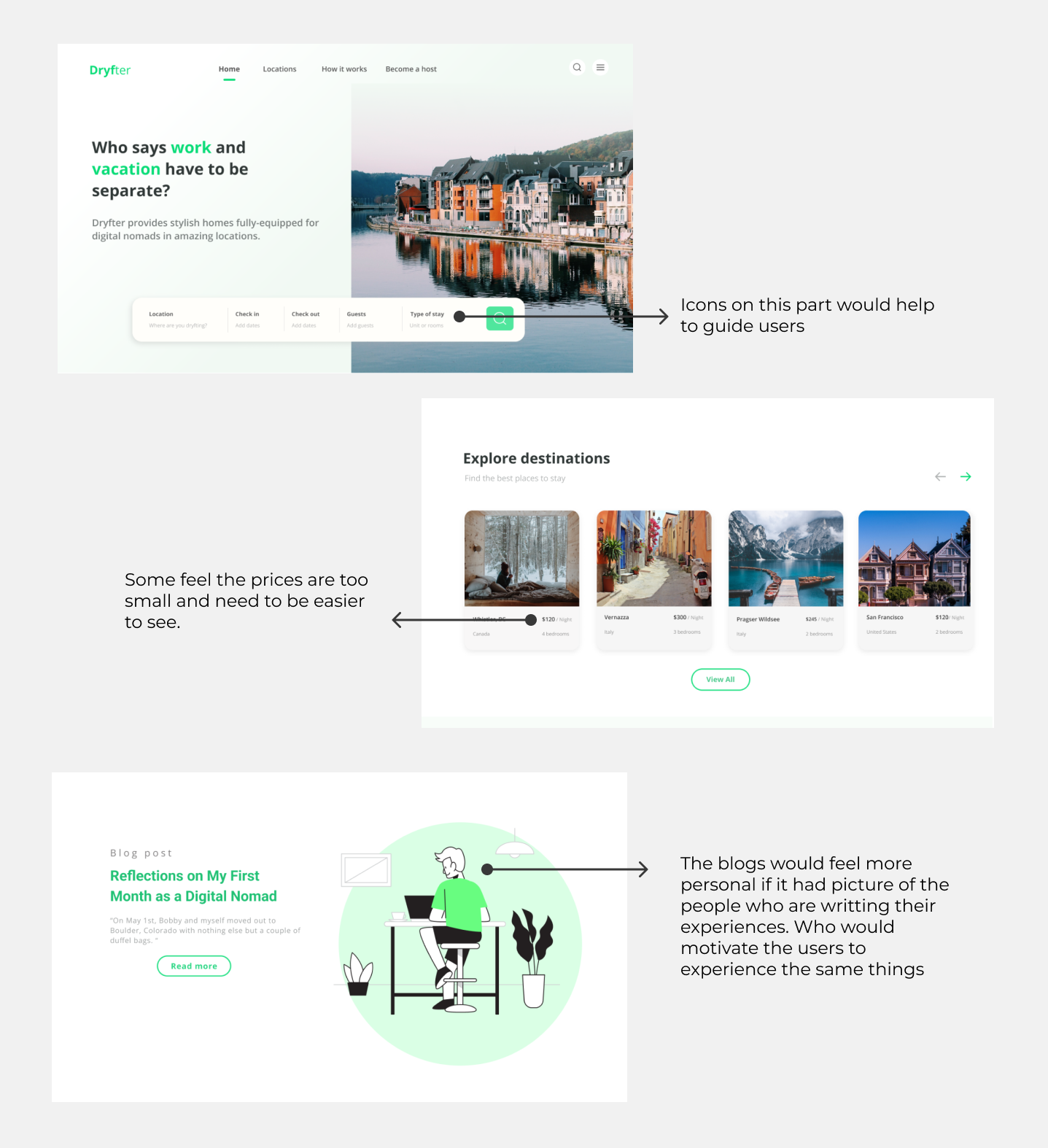
Finally, the other feedback I got, I didn't add here is that some feel the pages are very long and they would like to have a button that takes you back to the top of the site.
During this project I was able put myself into the shoes of a working professional who also seeks to travel and a change in the routine to understand their needs. Moreover, I had the oportunity to dive deep into the project and create something new with total freedom. This project has been key in my formation as a UX Designer, it made me confident in my investigation abilities and my ability to execute a plan.
"Focus in investigating, the project will come alive as long as the investigation is good." It was something I did not believe at first. I thought it wasn't necessary tohave so many different types of background research. However, the result proved me wrong. Every step of the investigation helped me in the construccion of the final project. From investigating how the companies think and their business models to hear from 1 to 1 what do the users need when they look for a place to stay.
Get used to a new method of work. I used to do UX Projects with a different method, before I used to do some background investigation and then I jumped into interviews or surveys, I was more worried about the UI of the application rather than the UX and so I wouldn't pay attention to an important step. However, during this project I got used to a new method, more organized and with its own story. It was hard because I was impatient and wanted to jump straight into the prototype and I would get worried about the visuals.
I wouldn't have guessed it at the start of the project but my favorite part was doing the investigation. Interacting with different people and hearing their inputs. Also, coming up with different methods of gather information all was a very Finally, The process of combining the investigation and creating a project it was a process that felt very gratificating at the end.
If you like what you see and want to work together, get in touch!